
Consider this bollard
For Safety
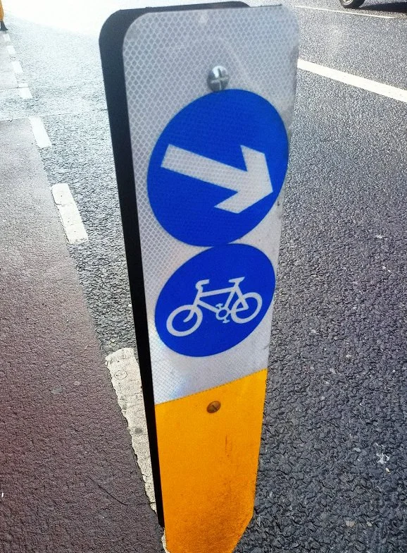
This is a new bollard that has been installed on the road to enhance safety measures. It marks the starting point of a protected cycle lane. The bollard has two reflective stickers on it.
The first sticker displays an arrow pointing towards the right and towards the outside of the cycle lane. This sticker serves as a reminder to vehicle drivers and motorcyclists to stay to the right of the cycle track.
The second sticker displays an image of a bike, indicating that this is where the protected cycle lane begins.egins

The Signage on the bollard
You’re a Cyclist
Imagine you are a cyclist riding at night with your bike lights on. You turn onto a busy road and suddenly come across a bollard with two reflective stickers that catch your eye.
The top sticker displays an arrow pointing right, but it's not clear that it's meant only for vehicles. The sticker below shows a bike, which is similar in design and in close proximity to the top arrow. This visual interference of information can cause confusion and may force you to make a quick decision without having all the information.
This is a problem
The design of this bollard poses a safety concern that I believe makes it more hazardous than if it were not installed at all. It's a regrettable situation that could have been avoided if the bollard's designers had prioritized the needs and safety of cyclists rather than placing so much emphasis on drivers' needs.
This issue is unfortunately not unique and is part of an ongoing struggle in Irish road design that many cyclists can attest to.
a quick fix
While writing this blog post I noticed that some of these bollards have been altered.
The issue appears to have been brought up to the council and a “fix” has been implemented.

To indicate that bikes should turn left, a small arrow has been added to the bike signage. However, this arrow (I’ve been calling it the Quick Fix Arrow) appears to be of poor quality and can easily be removed or worn down by weather. It's also not as reflective as the surrounding bollard and is small enough to be overlooked. As a result, it gets overshadowed by the larger and more prominent top arrow, which outshines this new addition in every way.

An illustration of what the Quick Fix looks like at night.
We see the added arrow is not as reflective as the rest of the bollard and also losing significance because of its size.
So not quite the fix I’m sure they were hoping for but reminiscent of another Dublin Council signage error.
The New Dublin City Street Signs
An upcoming blog post ;)
Thanks for reading.